This is Hani Rosli's portfolio development. Included is the description of the process in which her works are done and compeleted.
Thursday, October 14, 2010
Scanned drawings/doodles from sketchbook
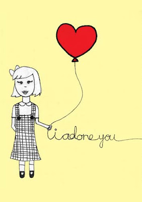
This first one was actually drawn as a birthday card. It was my best friend's birthday and i wanted to be different and stand out from the rest of her piles of birthday cards so I came up with this. Instead of saying happy birthday, it said "i adore you" (WHICH I DO). This was done originally on a card of paper, with black pen and marker, and the red heart was red construction paper cut out. After I scanned this in to add to my portfolio, I added in the yellow background because I thought it fit in well with the whole thing.
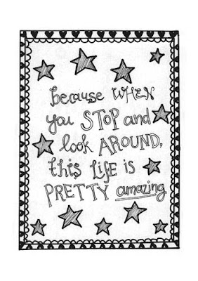
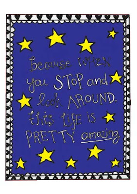
This other sketch was also done for a friend, as a birthday present. This quote is a favourite quoe of hers sp I drew it out, first on paper with black marker and pen. After that, I coloured in the yellow stars using crayon and after i scanned the whole image in, I added the blue in photoshop
Wednesday, October 13, 2010
Scanned drawings/doodles from sketchbook
Tuesday, October 12, 2010
Scanned drawings/doodles from sketchbook.
So this is aother one of my sketches. This time, it's inspired by one of my favourite songs: Breathe by Anna Nalick
LISTEN:
Honestly, the song means a lot to me so I wanted to turn it into a poster. First, I drew it out in my sketchbook and traced it in with a thick, black marker.
After doing so, I then scanned the image and edited it in illustrator to redefine the lines in the drawing. Once that was done, I coloured it in with photoshop, using only pastel colours to reflect the softness in both the song and the sketch I'd drawn out.
Smash arts cover FINAL
YES THE FINAL ONE. okay so for this one, I decided to change my background completely to make it more original.
I still used the rainbow background (if you can't tell yet, I enjoyed it immensely) but I saturated it a little and made it a bit more faded. After that I put in a sketch I had drawn out previously and layered it over the rainbow background, turning it into this
Once that was done, I put in the original masthead
And inserted the headers and whatnot. This time though, I decided to put most of it at the bottom of the page, in the rectangular box, and another headline in a grey circle at the side of the page.
Monday, October 11, 2010
Smash Arts Article
This time, we had to design a mock article for the magazine we had designed. This first article is about a guide to new media. Therefore, I searched for an imae that would sum up the professionalism of the use of new media and found this image:
(from Andy J Miller's flickr)
I decided to use this image as part of the design article and came up the colour palette which was a combination of these two:
Once that was done, I put the image in with the general layout of the article. Bfore that I had researched on what a typical article in a magazine looked like, and then copied the general layout of it.
I decided to use a font type that would reflect the image I had used and placed it right beside the image so that one wouldn't really have to compete the other. They're both balanced out. Once this was done, I put in the dummy text and ended up with this
Sunday, October 10, 2010
Smash arts cover 3
For the 3rd cover I did for Smash Arts, I tried to keep in with the theme of the other two covers and keep to lines/ angles and colour as the main focus of the cover. So the 3r image I found was this one
I then put in the ready made masthead, again only changing the colour of the masthead for visiblity. I really think that this masthead is suitable for the type of magazine Smash Arts is.
After putting in the masthead, I put in the headers at the front. However, due to the colour they were at first not visible, which is why I decided to put the black lines behind them to give it visibility. Turns out the black worked extremely well with the colours and tied in perfectly to get this end result.
Saturday, October 9, 2010
Scanned drawings/doodles from sketchbook
Friday, October 8, 2010
Smash arts cover 2
This is the second cover I came up with for the smash arts magazine. This time, the background is simple and very clean, and this was the running theme for the 2nd cover:
I already came up with the masthead earlier so I just inserted that onto this background, changing only the colours. As said before, I wanted to keep the design simple and clean, which means just straight lines and solid colours. So I put a yellow rectangle at the edge offset of the cover and inserted my headers there.
AFter doing so, it was just a matter of putting in the rest of the details and coming up with this end product
Smash arts cover 1
As a class assignment, we had to design a cover for Smash Arts magazine. The cover had to reflect the magazine's artistic content and had to look different and unique from all the other art magazines out there.
I really kind of struggled with this assignmet because there were just too many ideas that I had but non seemed to be unique enough or original enough for the magazine cover.
The first cover I designed was centred around the background image that I had found, which was this
I loved the colours so I decided to work my cover around this background. The first thing I did was to design the masthead for the magazine. I wanted the masthead to be something that could fit in with all designs that coule possibly come from the magazine so this was what I cam up with
The fonts are simple and the colour and type is recognizable enough. AFter coming up with the masthead, I came up with a list of other fonts that I could use for the header in the magazine. I wanted the fonts to loo very clean and futuristic so I chose exactly those type of fonts.
Once I had chosen the font type, I then worked my way around the background, fitting the headers all into the colours, and this was what I came up with:
Wednesday, October 6, 2010
Scanned drawings/doodles from sketchbook
These 2 sketches were drawn on the same day. The internet connection was spoilt so I had to force myself to find other ways to occupy my time.
The first sketch is a quote from a song by Jim Reeves and the second drawing was drawn on impulse as I imagined what it would be like to live in Paris. Yes, in my head the city of Paris looks like that. I am well travelled.
Tuesday, October 5, 2010
Rainbow Drops
As a class asignment, we had to design a poster for a new brand of candy called Rainbow Drops, with the tagline "rainbow drops keep falling on my head". Once I got this assigement, the first image that popped into my head were lips. The demographic for the ad was aimed mostly at young adults/adults, therefore I thought being a little provocative with the ad was a good idea.
I wanted an image of lips with a little sauce dripping on the side of the mouth. So I searched on the net and I found this image.
After finding the image, I had a clear picture in my hea dof what I wanted so I went out and looked for colour palettes. This was the one I ended up with because I thought that it perfectly suited the image of candy.
After getting the colour palette, I then had to decide on the font type. I wanted to use a font type that would give the imagery of it being actual candy, so I was looking for something that LOOKED chewy and sweet. So I gathered a couple of fonts to see which one fit best
After deciding on the font type to use, I ended up with this
However, I thought that the header still looked a bit of so I tilted it to the side like so
And this was my end product. I put in the rest of the tagline after, trying to keep with the colour palette and using the same font type as the header so as not to make the poster look too messy.
Monday, October 4, 2010
Scanned drawings/doodles from sketchbook
This sketch was done after I watched Memoirs Of A Geisha. Although i had read the book before and it did deeply move me, after I watched the movie, I was just so amazed by the costumes in it and the beauty of the geisha girls.
So I decided to try a sort of cartoon sketch of my version of a geisha.
This was done in my sketchbook, of course, with black pen and markers. After I was done sketching, I coloured it in a little with markers. However, I thought that the quality wasn't good enough so I scanned it in and coloured it a bit more, this time using photoshop.
and this was the end result. My interpretation of a Geisha.
Sunday, October 3, 2010
Designer Forum
For an assignment in class, we had to design a Designer Forum as part of the newspaper's 'life' section. For this assignment, there were a few considerations I took note of. First was that this being specifically a DESIGNER'S forum, the segment had to look 'artsy' enough but at the same time still look like it belonged in a newspaper. What I took this to mean basically was that it had to be artsy but not too artsy.
Yeah, a little confusing for me, too.
Therefore what I did was to look at the actual life segment in the newspaper and try as much as i could to follow a similar style so that it didn't deviate away too much from the style of a newspaper article.
So I copied their header so that I could implement it into my article
After that I did an initial design for the forum. The focus of this design was mainly the header, which was done using a Hans Solo font. I though that the font had just enough edge to it that it would make the article look designer-ish.
However, after much thought, I decided that there weren't enough design elements to it and that the use of font in itself was not enough to make the forum look like it was made for designers. Therefore I change it up a bit, and added more colour, specifically the red in the middle, to make it really stand out.
I put the header in diagonally across the page - something that isn't normally seen in the newspapers - and had lines branching out of the header and leading out to articles on the page. I thought that this design was unconventional enough to look like it was for designers, but still stayed true to the essence of the life segment of the newspaper.
Saturday, October 2, 2010
Teen Pregnancy Poster
For our UT 2 practical, we had to come up with an advertisement poster. There were a few choices for the advertisement but the one that really struck me was the teen pregancy one because I actually know a friend who had gotten pregnant at a young age. Therefore I chose to do a design based on that.
The constraints of designing the poster was that we were only allowed to use text and colours to create the poster.
First, I brainstromed on what I wanted to put in the poster. I decided that I wanted to place a silhouette of a pregnant woman as the main focus in the poster. So I found this image
and using illustrator, I copied her sillhouette and then transferred it into photshop to look like this
then i decided to put in the text that would really make an impact. I put the text in the silhouette's stomach to really drive the message in
after that, I placed all the other text around the silhouette. But I hadn't decided on a colour palette. So I experimented with a couple of colours, most of them being blue
However, I didn't think that the colour was eye catching enough, nor did it directly signify with the message in the poster. So I decided to look online for colour palettes and decided to go for shades of dark red. Mainly these:
I thought that the red would be both eye catching and go hand in hand with the message of the poster because red sometimes represents danger (COLOUR PSYCHOLOGY).
And after all those considerations, this was my final product
The constraints of designing the poster was that we were only allowed to use text and colours to create the poster.
First, I brainstromed on what I wanted to put in the poster. I decided that I wanted to place a silhouette of a pregnant woman as the main focus in the poster. So I found this image
and using illustrator, I copied her sillhouette and then transferred it into photshop to look like this
then i decided to put in the text that would really make an impact. I put the text in the silhouette's stomach to really drive the message in
after that, I placed all the other text around the silhouette. But I hadn't decided on a colour palette. So I experimented with a couple of colours, most of them being blue
However, I didn't think that the colour was eye catching enough, nor did it directly signify with the message in the poster. So I decided to look online for colour palettes and decided to go for shades of dark red. Mainly these:
I thought that the red would be both eye catching and go hand in hand with the message of the poster because red sometimes represents danger (COLOUR PSYCHOLOGY).
And after all those considerations, this was my final product
Friday, October 1, 2010
Scanned drawings/doodles from sketchbook.
Subscribe to:
Posts (Atom)